
Data to Wisdom
- Apr 5, 2023
- 3 min read
I recently read an article in The Australian about aphorisms, written by social commentator Phillip Adams, which piqued my interest. He reflected on pithy sayings like “easy come, easy go” or “all that glitters is not gold”. But this was the saying that caught my attention:
"Data isn't information. Information isn't knowledge. Knowledge isn't wisdom"
I’m Bruce Grady, the Chief Customer Officer at FloodMapp, and with my personal experience as the former Assistant Director-General, Emergency Management Queensland, I found a strong connection to this idea. Emergency management is first and foremost about people. A flood, for example, in a remote area that doesn’t impact any people is just a natural event. It’s not until people are affected that it becomes a natural disaster. The saying above is also fundamentally about people – data is a passive attribute, it is only when we process, understand, and apply human experience, intellect and history that we have a chance to transform data to wisdom. The definition of wisdom I am working with is the ability to make good judgements based on experience, knowledge and understanding.
This is the primary premise of FloodMapp’s approach to developing flood intelligence tools for emergency managers. As emergency events unfold, we are either overwhelmed by the sheer volume of unstructured data, or scrambling to find some data, any data!
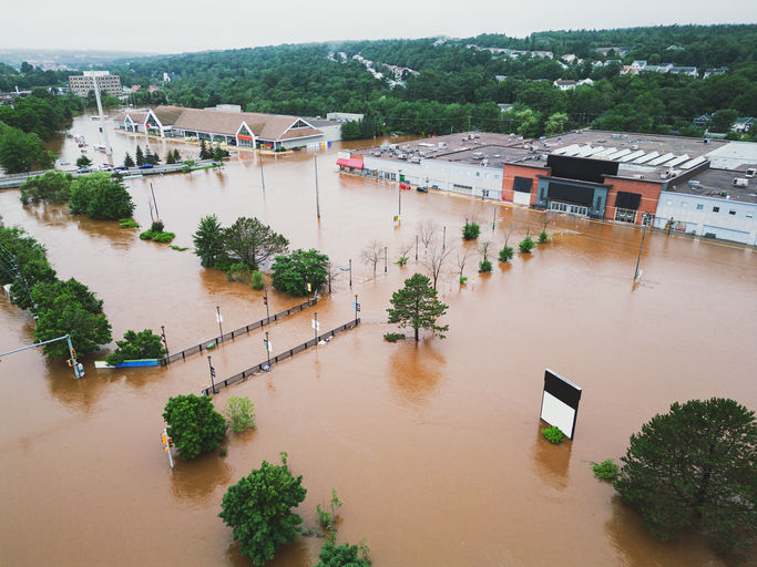
The ‘Lego Model’ (Figure 1) is a great visual to understand this critical transition from data to wisdom. We start with a pile of data that has volume but little form. We then sort that pile into something useful, then to arrange and present visually gets us a step closer to something valuable. The key, however, is the ability to present the data in a way that tells a story that is easily consumed, focuses on the need at hand, and informs evidence-based decisions.

Ultimately, the goal is to present data in a way that enhances the human dimension of applying experience, knowledge and understanding.
At FloodMapp, we deeply understand this connection between flood impacts, data, and people. Unless emergency managers can rapidly comprehend the situation, convey that understanding to those impacted, and enable the rapid application of their experience to actionable decisions, we cannot hope to effectively respond to floods as they happen.
Our products – ForeCast, NowCast and PostCast – enable those intelligence ‘stories’ to be packaged in a meaningful, visual and easily-digestible way to support decision-makers before, during and after flood events.

Using the ‘Lego Model’ in a FloodMapp context looks a little like this:
Data: tells us it is likely to rain.
Sorted data: indicates the likelihood that rain may lead to flood in a catchment.
Arranged data: tells us the expected height of a river at specific locations.
Data presented visually: shows us the likely inundation extent within and
across catchments as an event unfolds.
Data, in its various forms, is incredibly important and already available to emergency managers however it doesn’t show the specific impact of the flood. It doesn’t look at the flood data and explain it with a visual story. FloodMapp, however, takes data and displays it as a story in the form of a map that shows the flood extent including what specific properties, assets, or roads are impacted. From the impact maps, we can also see the specific locations where responders are needed, what skills and equipment are required, and how to get there. Seeing the story as it unfolds in real-time and being able to answer these questions with timely and rightsized actions is the difference between a best guess and real wisdom.
The journey from data to wisdom is one of many parts. Emergency management wisdom is delivered by great decisions. Those decisions can be powered by FloodMapp’s intelligence tools and interpreted by your experienced people.
If you’re interested in furthering his discussion, contact us at via hello@floodmapp.com


vnew88.net dạo này thấy bạn bè nói nhiều nên mình cũng ghé thử cho biết, kiểu vào xem giao diện ra sao thôi chứ không ngồi lâu. Vừa mở lên cảm giác trang nhìn khá thoáng, nền với chữ dễ nhìn nên lướt không bị mỏi mắt. Mình để ý họ chia nội dung thành từng khối rõ ràng, kéo xuống cái là biết đang ở phần nào, không bị dồn chữ tùm lum. Cái mình thích nữa là thanh menu đặt khá dễ thấy, bấm qua lại mấy mục không phải mò, người mới vào chắc cũng đỡ rối. Nói chung mình chỉ xem vài phút cho vui mà vẫn thấy bố cục chia block và menu điều hướng…
rr88 link mình mới thấy bạn bè nhắc nên bấm thử cho biết, kiểu tò mò xem trang chủ trông ra sao thôi. Mình không có ngồi đọc kỹ từng mục, chỉ lướt qua xem bố cục có dễ chịu không. Cảm giác đầu tiên là trang nhìn khá thoáng, các phần chia khối rõ ràng nên kéo xuống không bị rối mắt, nhất là đoạn giới thiệu với phần khuyến mãi tách riêng nên dễ nhận ra. Có chỗ họ ghi RR88 tham gia thị trường từ 2018 và đặt trụ sở ở Philippines, thấy để thông tin vậy cũng đỡ mơ hồ. Thanh menu đặt ngay chỗ dễ thấy, bấm qua lại cũng mượt, và mấy tiêu đề…
https://ball88.link/ mình bấm vào xem thử cho biết vì thấy mọi người nhắc, kiểu lướt giao diện là chính. Vào trang cái thấy bố cục chia khối khá rõ, kéo xuống không bị rối mắt, nhìn phát biết chỗ nào là giới thiệu, chỗ nào là nội dung chính. Mình cũng để ý họ có đoạn nói về bảo mật SSL 256-bit, đặt ngay trong phần giới thiệu nên đọc lướt vẫn nắm được ý. Menu để ở vị trí dễ thấy, chuyển qua lại mấy mục không phải mò lâu. Nói chung cảm giác trang làm gọn gàng, chữ nghĩa không nhồi nhét, mấy tiêu đề và khung thông tin tách bạch nên nhìn vào là nhận ra đang…
The Lego Model showing data turning into a story map really clicked for me - it's like those i ready percentiles, raw scores need context to mean anything.
tải sunwin mình mới ghé thử vì thấy mọi người bàn tán, kiểu vào xem giao diện với cách họ trình bày thông tin thôi. Trang nhìn khá dễ chịu, các mục chia theo tiêu đề rõ ràng nên lướt nhanh vẫn nắm được ý chính, không bị rối mắt. Mình có đọc qua phần giải đáp thắc mắc, thấy họ nói thẳng chuyện một số quốc gia sẽ bị hạn chế truy cập và nhắc luôn điều kiện 18+ mới được đăng ký, đọc cái hiểu liền. Mình thích kiểu họ viết ngắn gọn, không vòng vo, nên không cần ngồi mò lâu. Kéo xuống dưới vẫn giữ bố cục dạng từng khối nội dung, tiêu đề “Giải Đáp…